
Update 2024: While the UI is a bit out of date in this post, I’ve preserved the mobile improvements discussed here (and continued to move towards a more useful mobile experience with additional improvements).
Most of the time that I use music4dance it’s on desktop computer, but I certainly want access to all of what it can do on my phone and tablet. And I have tried to take what user interface designers call a “Mobile First” approach whenever possible.
But I noticed a while back that there are a few things that just weren’t working as well on smaller devices as I would like. Several of them were on the core song list pages, which is particularly important.
So I finally took a couple of days off from other things and reworked these issues.
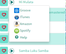
The Play Menu
The play menu (which is documented here) is now a modal which allows for bigger buttons and the ability to control the sample being played.

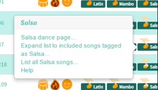
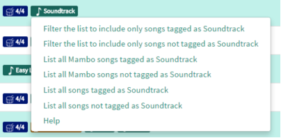
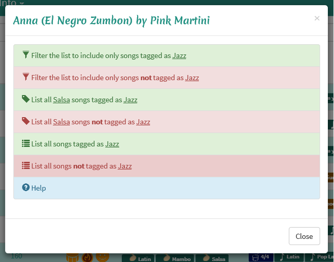
Dance and Tag Menus
I’ve also converted the dance and tag menus (documented here) to modals. This let me make the buttons bigger as well as adding some styling that I hope will let you navigate through options more easily. The large chunks of text in the old interface were hard to distinguish even for the person that wrote them.

Let me know what you think. Do you prefer the before or after? Are there other aspects of the site that you find difficult to use on a small device? Let me know by responding to this post or sending feedback.
